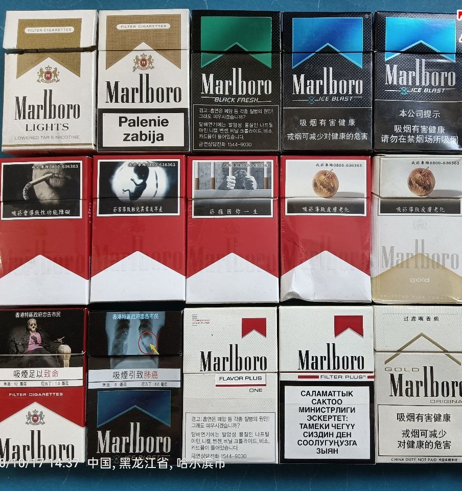
Packaging plays a crucial role in cigarette branding, and the designs of these four brands reflect their market positions.
Marlboro sticks to its iconic red-and-white chevron design. It’s instantly recognizable and symbolizes decades of brand history. The minimalist, bold packaging aligns with the brand’s rugged and masculine identity.
Rothmans features elegant blue and silver packaging with a crest, giving it a sophisticated, almost regal appearance. The design emphasizes tradition and class, making it appealing to more mature or professional consumers.
Horizon uses simple and functional packaging, often with muted colors. The focus is on clarity and affordability, with little attempt to be visually striking. This reflects its status as a value brand.
JPS uses striking black or deep blue packaging with gold or silver accents. The design is sleek, bold, and modern — often associated with luxury or sport. It appeals to younger smokers who prefer a stylish and confident aesthetic without the premium cost.

Leave a comment